Though the BLMS Dashboard is the first screen to load when a user logs into the application, the space was incredibly underutilized. Through initial user surveys I discovered that users were simply skipping the dashboard entirely and navigating straight to their licenses. It was an extremely poor waste of real estate and I was tasked with creating a new dashboard that would engage users, increase efficiency, and aid user workflow instead of hinder it. A helpful and useful dashboard would give our app an additional competitive edge in the industry as well.
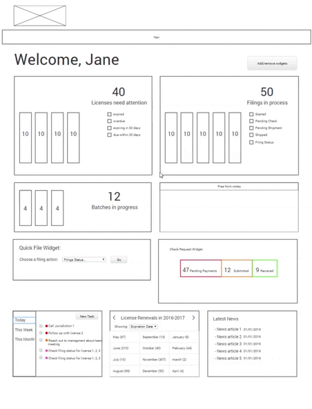
 Old Dashboard Design
I began with speaking to some of our power users about their biggest pain points on the application, in hopes that the dashboard solution might help solve some of those sore points. I discovered a few interesting points:
As I put together the interaction design prototype I included solutions to directly address the user goals I’d discovered earlier. Features such as:
Once the interaction prototype was tested and iterated accordingly, I got to work on the visual design. I wanted the UI to be pleasant and fun to interact with, without being too distracting or unprofessional for the users. I had previously built a loose UI toolkit for other areas of the application I had redesigned and I used those elements to stay consistent with the colors, fonts and overall aesthetic. I created all the icons myself.
I also created a recall system with my color scheme - i.e. Red = Must Act Now , Yellow = Pay Attention But Not Dire - to help users better identify and organize their portfolio information as much as possible. What started as pie graphs became bar graphs, since in testing I discovered that users found the bar graphs easier to interpret quickly, and efficiency was a main goal of this project.
The dashboard was designed to be modular and easily scalable. I wanted to create a space that can eventually house any widget that a user decides is helpful for their workflow. As we add more widget options, users can continue to customize their dashboard to suite their own workflow. It is responsive to different browser screen sizes to accommodate many different kinds of users.
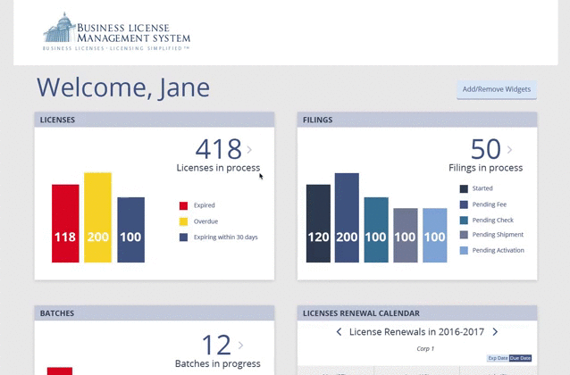 Dashboard Hifi Prototype
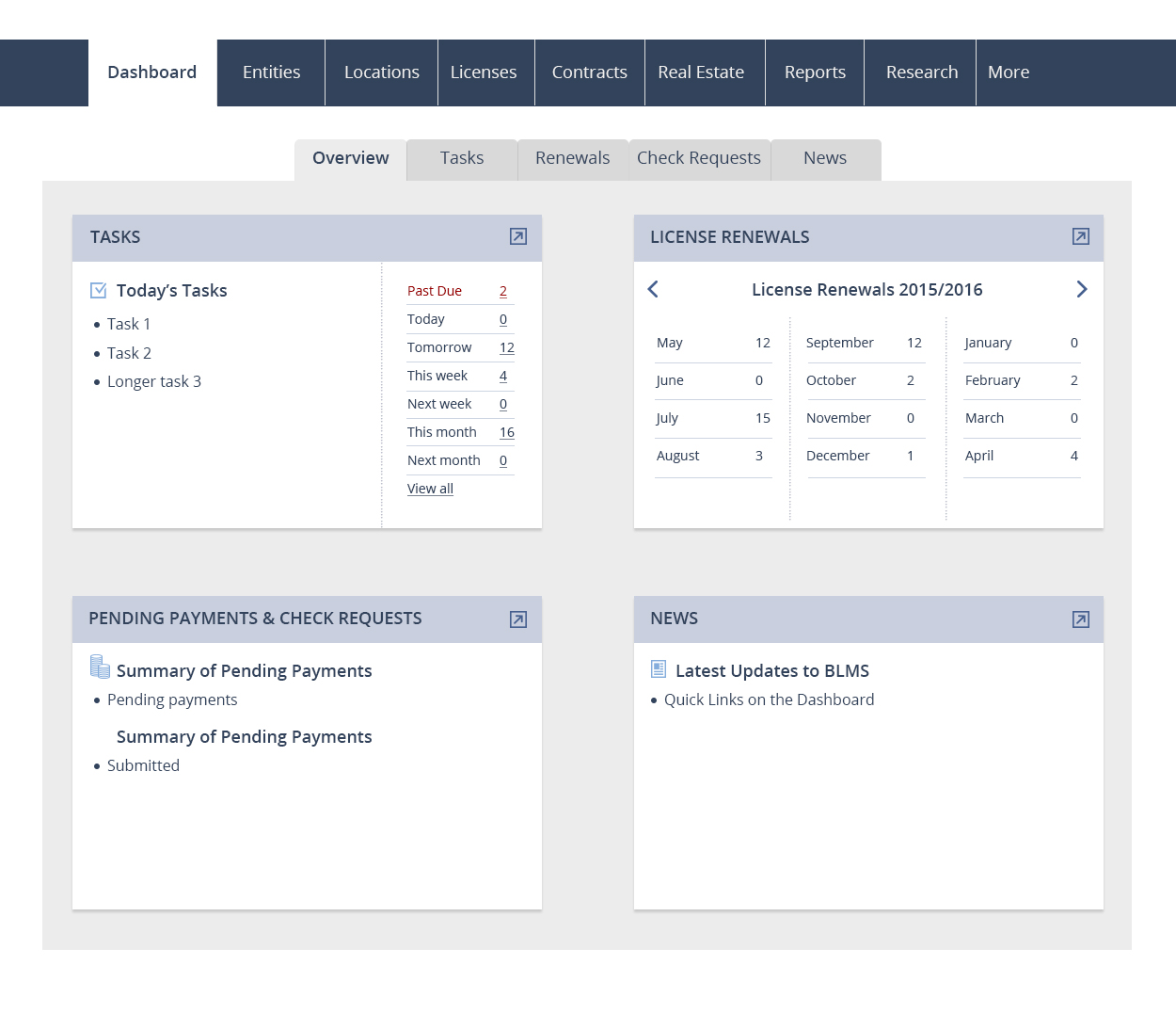
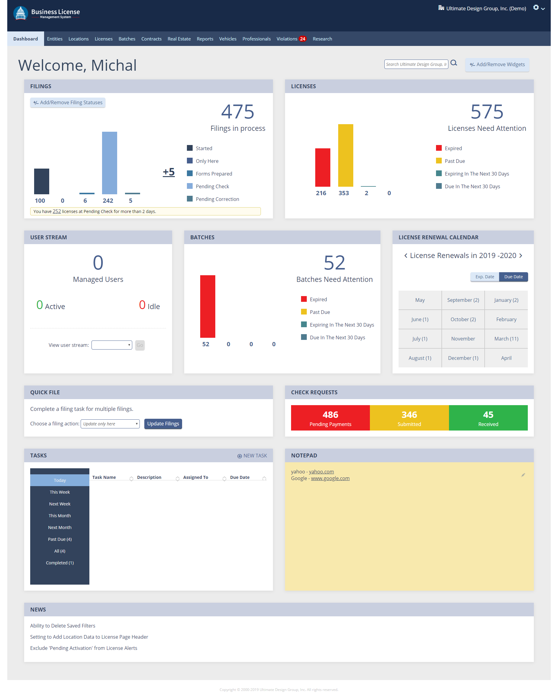 Actual Dashboard Screen Capture
Since releasing the Dashboard redesign, the feedback has been excellent. Users are using the efficiency tools - like the Quickfile widget - heavily and are very pleased with how it has sped up their workflow. Overall, since I’ve begun my work on BLMS the application has gone from a 46 NPS (user rating) score to an 86 and it is still climbing.